PROJECT INFORMATION
Clear Communication, Strong Foundations
As a renowned interior design firm rooted in Hong Kong for 21 years, HB & L Limited seamlessly integrates smart systems and eco-friendly safety into its interior design concepts, while adding a refreshing and trendy style that brings comfort and joy to users.
At HB & L, we believe transparency is the cornerstone of trust. Every design we create is not just the shaping of space, but an extension of relationships.
BRAND CONCEPT
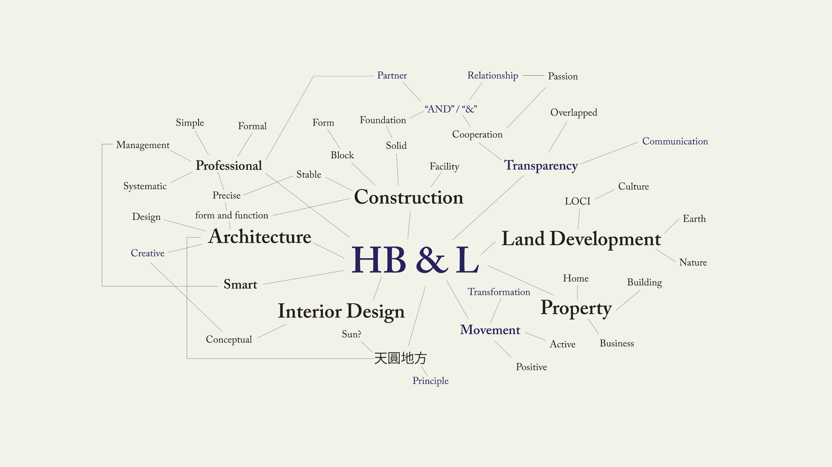
We are honored to have partnered with HB & L Limited, a firm specializing in land development, architecture and interior design. The founder of HB & L places great emphasis on transparency in all work — whether between clients, employees or within the company itself. He believes transparent communication fosters trust, which is why the brand’s tagline is Transparency builds trust.
Notably, HB & L’s interior design team boasts extensive industry experience, having served a diverse range of prestigious clients including Cheung Kong Group, Hutchison Whampoa Group, Kowloon Motor Bus (1933) Co., Ltd., Dah Chong Hong Group, Maryknoll Fathers’ Association Pak Tin Home for the Aged, and the Catholic Diocese of Hong Kong. The firm has also undertaken interior design projects for schools and religious organizations, such as Yan Chai Hospital Yim Yu Shan Kindergarten, International English Kindergarten, Tai Po Baptist Church Kindergarten, The Buddhist Tsang Kor Sing Anglo-Chinese Kindergarten, Sheng Kung Hui Kei Hin Primary School, Catholic Ng Wah Primary School, The Yuen Yuen Institute, and Wah Ying College.
- Brand Goal: Refine design and create a new trendy aesthetic
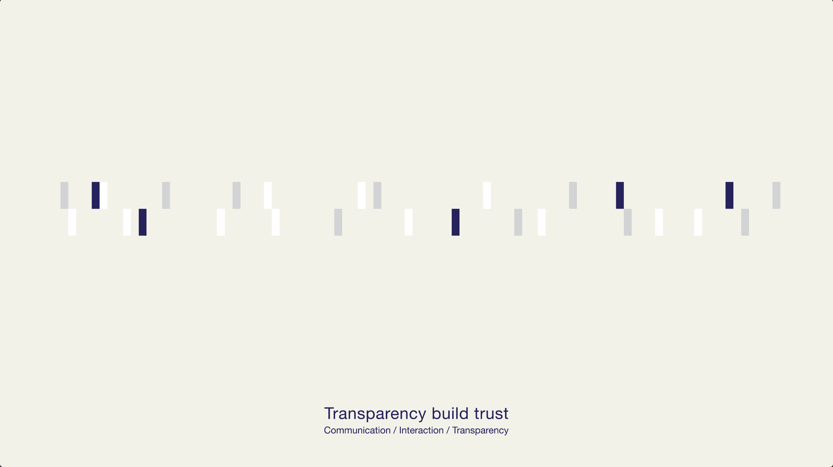
- Brand Mission: Transparency builds trust
- Brand Personality: Modern, Professional, Trustworthy, Transparent, Communicative
It’s About Design, Even More About Original Aspiration
After aligning with the founder’s core philosophy, we delved deeper to uncover the brand’s unique essence.
Architecture is more than just physical space; it is an important vessel for life. Rich experiences and events unfold within it, and human interactions, shaped by the space itself, become the core of vitality.
The founding of HB & L is the result of architects and interior designers reflecting on and exploring their relationship with urban environments and social structures. HB & L’s designs always offer a solution to the universal urban challenge of space scarcity, rooted in the ancient cosmic concept of "Heaven is round, Earth is square": the scale of life is central, and the user is always the priority.
Past and present, inheritance and innovation
— all stand before us.
Design Is a Door, Where People Meet for a Moment
With the brand mission of "transparency" and the cosmic concept of "Heaven is round, Earth is square" as our foundation, we aimed to create a mysterious spatial experience through the LOGO that transcends conventional thinking — a space with alternating widths and heights, flat and sloped surfaces alike, guiding viewers to break free from reality and enter a unique structural realm.
We therefore used bold typefaces to convey the stability of architecture. In the design of "HB", we employed translucency and residual shadows to establish a multi-layered connection. From a distance, the "HB" appears as a single, complete letterform; up close, the letters "L" and "W" are dynamically integrated into the structure.
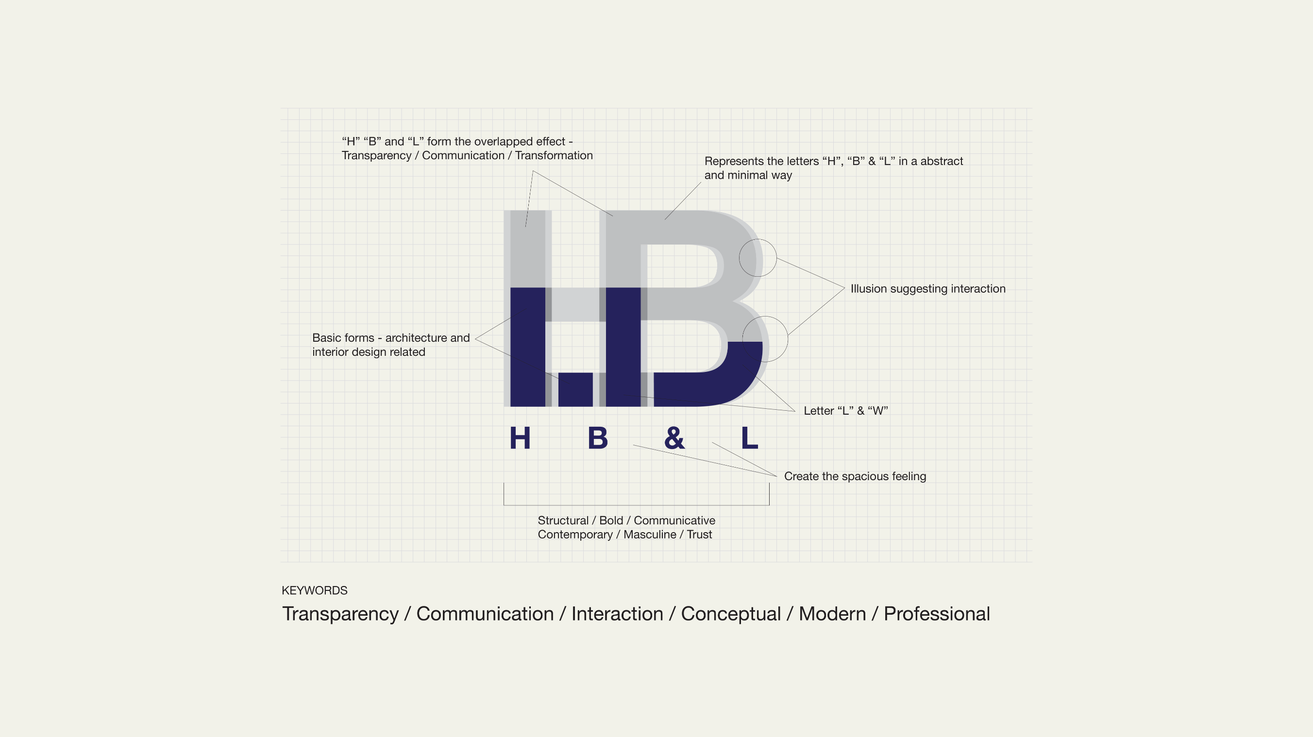
On the other hand, HB & L has undergone a team restructuring. To reflect this, the upper half of "HB" is rendered in a translucent light gray, representing the team’s past; the lower half is a solid deep blue, with horizontal overlapping forming not only the letters "L" and "W", but also symbolizing the initials of the two current founders’ surnames and their favorite colors.
The evolution of color transparency not only embodies the brand’s core value of transparency, but also symbolizes an inclusive attitude that fosters a harmonious development environment for diverse designs and industries. It achieves a new unification of architecture and technology, and embeds human communication and ideological connection into every design expression.
Harmony of Rationality and Order, A New Journey Begins
How to visually and spatially express HB & L’s unique identity of transparency became a key design challenge.
When designing the business card structure and even the spatial visual language, we posed three core questions to guide our design logic:
- 1. How to create a highly recognizable visual identity and memorable impression
- 2. How to embody the aesthetic standards and brand characteristics of architecture and interior design
- 3. How to convey a strong sense of texture
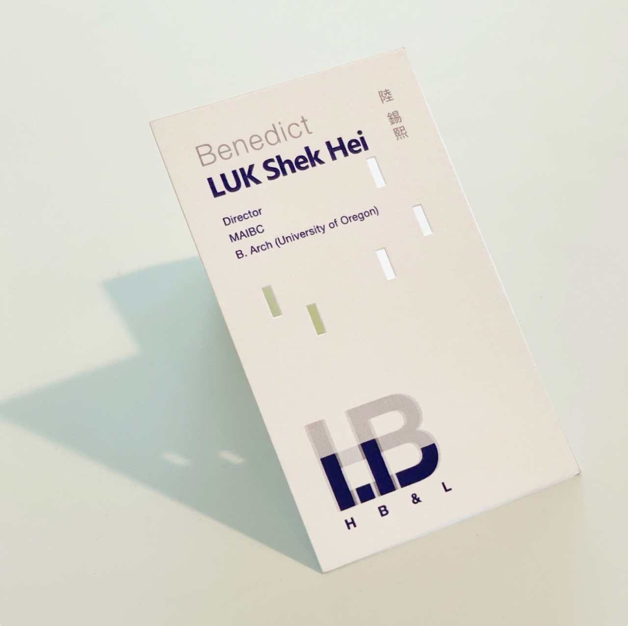
Based on this, we decided to take the rectangular shape formed by the overlapping effect in the LOGO as the core visual element, and extend it throughout the business card design.
The irregular arrangement of rectangles and edge die-cutting create a light-transmitting effect, embodying the brand’s emphasis on transparency.
If light is used as a medium to observe from the outside, refracting the physical space, each layer of rectangles becomes an independent transparent luminous body, making the design appear as if it is in a floating state — much like architectural suspension.
As a whole, the vertical movement of the rectangular blocks forms a continuous stepped effect, creating a highly memorable visual impression. We selected paper as the primary material to achieve a distinctly modern spatial texture, crafting the brand’s first visual experience for all audiences. This business card design has also earned praise from Kan Tai-keung, a renowned Hong Kong graphic designer and ink painter.
Creative Statement
As a small, diversified design studio, CForest has always strived to break free from fixed design thinking. We immerse ourselves in every detail with the same attitude as the brand and its founders, starting from the brand’s story, philosophy and essence to unlock more creative possibilities for design.
It is this multi-perspective, integrated, distinctive and unique way of thinking that provides the creative foundation for every new challenge we take on.


