Picture The Future
「The approach of Y&L will be applied to tap niche market, as well as talent development, and synergy enhancement, persistently satisfy client’s demands and boost young generation’s value.」
TEAM CONCEPT
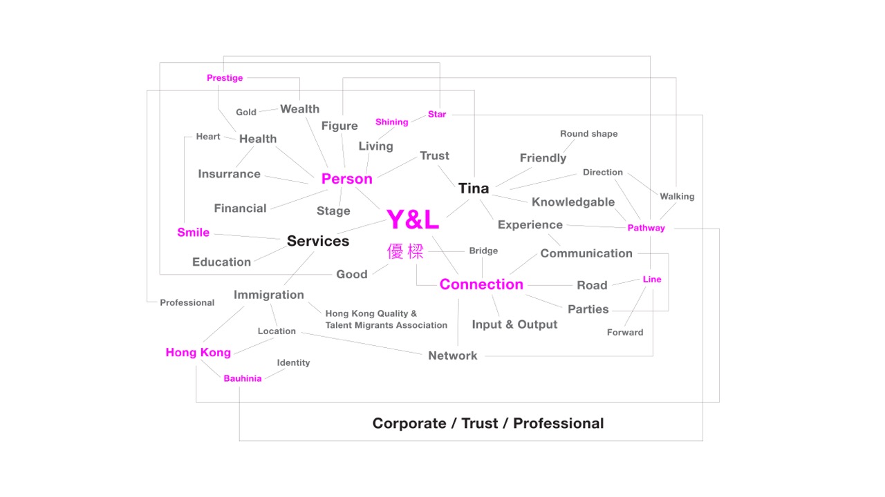
In recent years, we have helped numerous financial industry teams elevate their corporate image design, and this project is no exception. Tina, the team leader, built the brand around the company name as the core, with the Chinese character 樑 (Liang, meaning beam/bridge) setting the tone. She crafted the brand philosophy and slogan: "Nurturing top talent, paving the path to extraordinary success".
- Brand Goal: Uniting talent and progress to build a resilient future
- Brand Mission: We embrace diversity and inclusion, offering a broad stage for talent to shine, and empowering the new generation to boldly showcase their strengths
- Brand Personality: Professional, Forward-looking, Innovative, Proactive
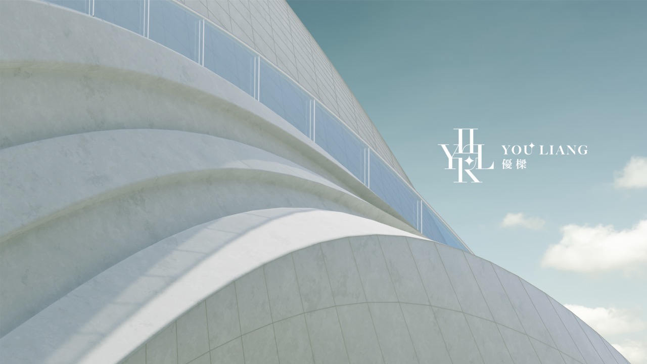
Forging a Brilliant Path Centered on People
Strategically, the Chinese name 優樑 (Youliang) is a lasting legacy dedicated to building a talent bridge. 優 (You, meaning excellence) represents the unique individuality of people and the brand’s enduring commitment to supporting talent; 樑 (Liang) symbolizes connection, integration and the provision of problem-solving solutions.
Through in-depth communication with Tina, we discovered the team’s core stance: it is not merely about distinguishing people’s talents or skills, but about striking a delicate yet powerful balance between trust and professionalism. Talent, to Y&L, is an identity forged by adversity and built on optimism. This clearly stems from the profound mutual understanding between the brand and its clients, conveying the brand’s direction of "Excellence, Professionalism, Progress with the Times" in a precise and compelling way.
With the brand direction defined, we began to explore the integration of English letters and Chinese characters.
To uphold the meaning and purpose of the name Y&L, and to shape Youliang as a human-centric, purpose-driven and above all, attractive brand, we chose to center the logo design on English letters. Visually, we created an interwoven connection between the four letters Y, L, H, K—a visual metaphor for the brand’s role as a bridge paving the way for international development.
Drawing Inspiration from the Traces of Nature
In Hong Kong, it is not enough to merely reflect the courage to strive for excellence; the brand must also convey an optimistic outlook for the future, alongside a focus on structured learning, experience summary, and the critical importance of its team members. This requires a unique blend of empathy and warmth—and Y&L has truly built a cohesive and diverse talent ecosystem.
Thus, the core challenge of this logo design was to align its form and imagery with the brand’s philosophy, and to create a flexible design that bridges reality and vision.
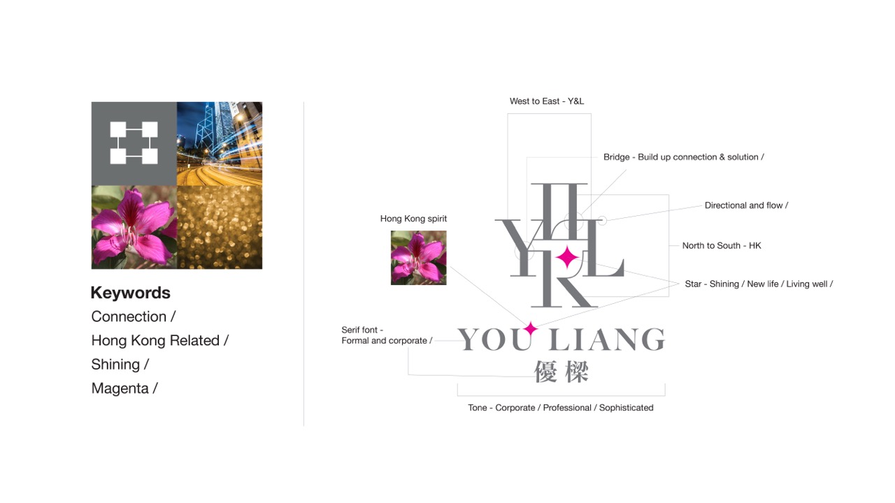
Through the careful composition of space, color and layout, and the use of varying line weights in the English typography, we achieved the perfect visual balance of talent and connection: The horizontal arrangement of Y and L evokes the visual image of a bridge, the brand’s core symbol; H and K (for Hong Kong) represent the north-south talent flow, symbolizing the connection of professionals from the Chinese mainland to Hong Kong. We added a star as the finishing touch to the entire visual system—a symbol of talented professionals shining bright and forging a brilliant future in Hong Kong.
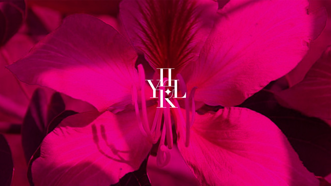
The color palette features two custom tones: magenta and gray. Magenta is an ode to Hong Kong’s bauhinia flower, brimming with vitality and a contemporary spirit; gray embodies professionalism and inclusiveness. The two hues complement each other, shaping the corporate and personal image of the company and Tina across multiple dimensions.
The Interconnectedness of People
We echoed the bridge motif from the logo in the extended design, adopting a human-centric, circular spatial structure. This structure outlines the team’s atmosphere—one that is as precise, solid and open as a geometric shape.
The poster design adheres to the principle of "simple yet sophisticated", with a strong focus on spatial quality. This creates a subtle connection between graphic expression and the external environment, mirroring the innate human quality of seeking connection with others.
Design is About Evoking Intuitive Moments of Delight
Our design practice consistently evolves in this unique way:
First, we identify elements that resonate with the brand’s core identity, for we believe in the untapped potential of natural inspiration. Just as the materials and craftsmanship of every architectural site are intertwined with its environment—including climate, culture and local people—b
rand design must also root itself in context. This is our most important role: to draw from the natural environment to express brand-aligned values, transforming abstract ideas into accessible visuals that reshape and elevate brand value.


