
Go Beyond Greatness
MAMBA is a chamber of commerce gathering a group of young and dynamic entrepreneurs. The name is inspired by the members' passion for basketball and their admiration for the late basketball player Kobe Bryant, who was affectionately known as the "Black Mamba"—hence the chamber is named MAMBA.
- Brand Goal: To build a high-end platform for business exchange
- Brand Mission: Embrace proactive change, pursue the best version of oneself, and strive for greater heights
- Brand Personality: Young, Proactive, Dynamic, Astute
Metamorphosis | Like a Butterfly’s Rebirth
reflections from the dream of a butterfly;
MAMBA captures the joy of aspiration like a butterfly,
exploring the splendor of breaking free from the cocoon and emerging as a butterfly.
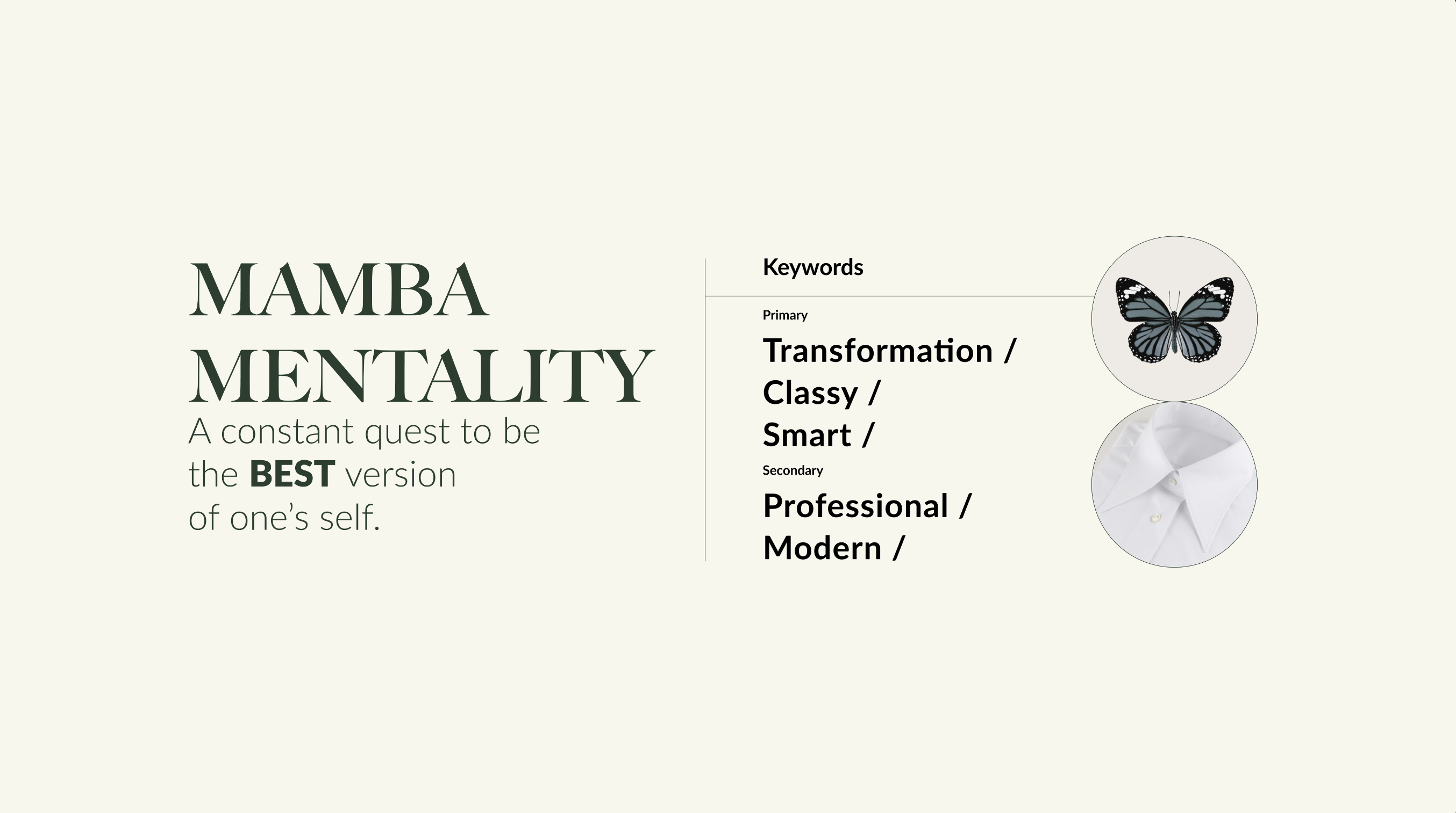
"A constant quest to be the BEST version of one’s self." This is the Mamba Mentality—a belief in relentlessly pursuing one’s optimal self, exploring endless possibilities, striving for continuous progress, and achieving greatness. It is the very spirit of Kobe Bryant.
This spirit of proactive transformation led us to the metaphor of the butterfly’s metamorphosis—the process of evolving from an egg to a caterpillar, then a chrysalis, and finally emerging as a butterfly, undergoing constant growth and evolution.
Chasing the Butterfly’s Trail, Dreaming Amid Heaven and Earth
"What is endowed by heaven is called nature; following nature is called the way."
"Colorful butterflies flit freely by their nature, lingering on willows, hovering over flowers, startling swallows, and being chased by people."
Butterflies in all their forms become a spark of intuition that illuminates the world around them.
The butterfly’s metamorphosis symbolizes a harmonious space that is insulated from the hustle and bustle of the outside world—a fusion of diverse cultures and personalities that endows the brand with natural grace and elegance.
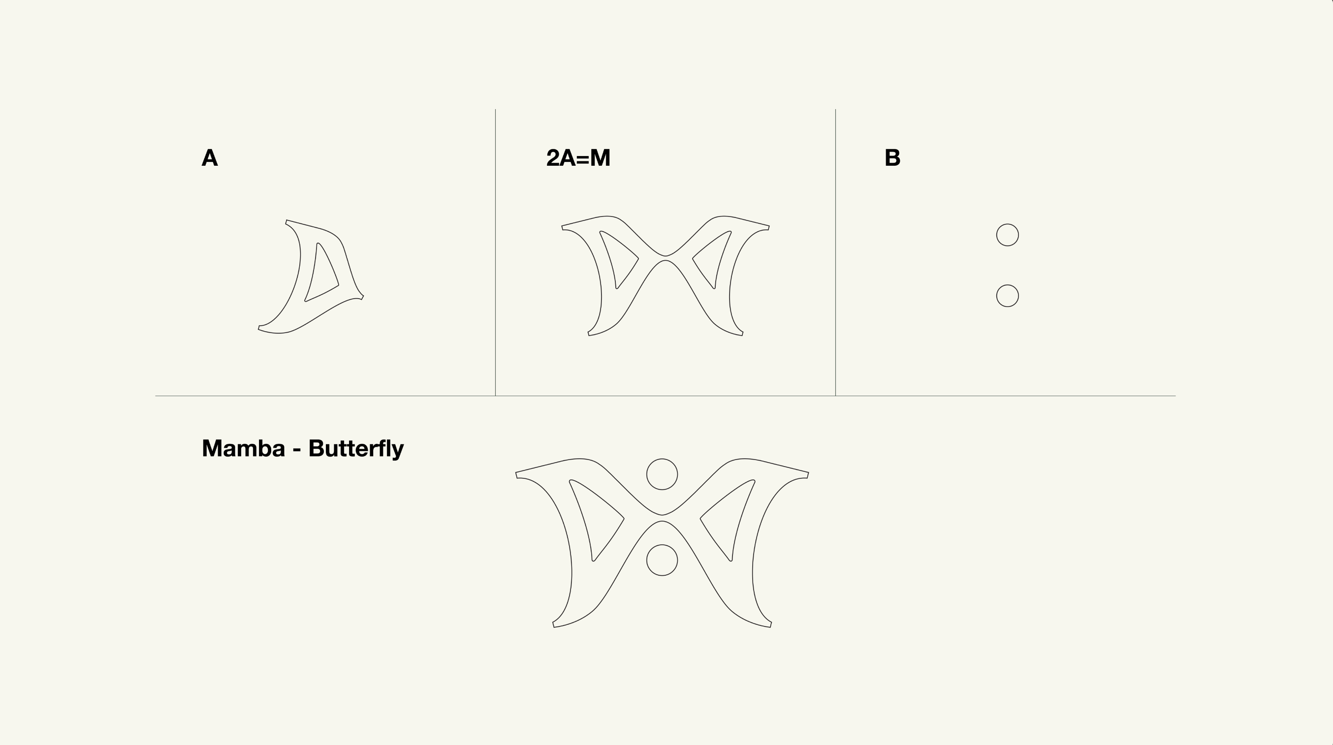
In the graphic design of the LOGO, we use the letter A from MAMBA, arranged vertically to form a butterfly’s wings; mirroring two A’s left and right creates the letter M; and adding two small circles forms the letter B.
The overall visual presents the image of a butterfly, while also subtly evoking the shape of a suit bow tie—an echo of the chamber of commerce’s business background. A circular outline encircles the butterfly, symbolizing harmony and representing the chamber as a united community. The minimalist letter-based design lends the brand an air of precision, astuteness, innovation and professionalism.
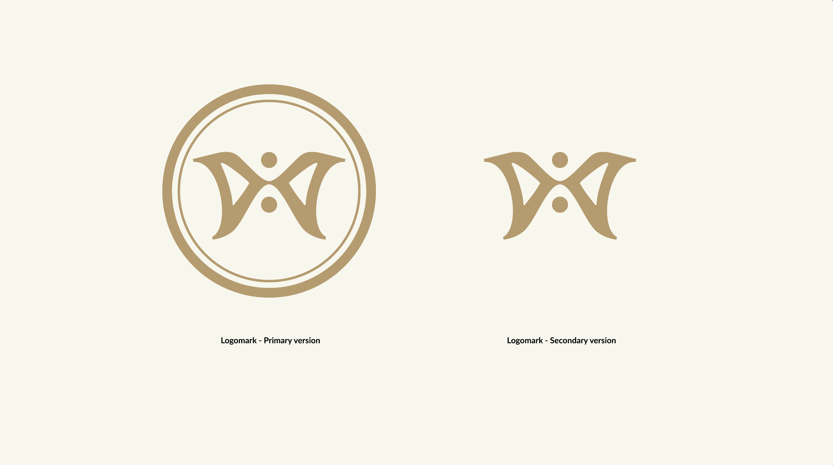
MAMBA Chamber of Commerce has two core member tiers: Green Light Members, and Gold Badge Members—the latter being the upgraded tier for invited guests. We translated this tiered structure into the LOGO’s color palette: gold and deep green, which together craft a sophisticated and premium brand atmosphere. Green symbolizes excellence, as well as the trust and authentic identity among chamber members; gold represents the elevated status of the premium tier and the pursuit of greatness.
Infusing Art into Graphic Design, Blurring Commercial Boundaries with Cutting-Edge Expression
a blend of modernity and allure.
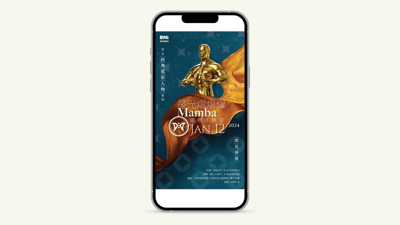
We adopted a classic movie poster design style, amplifying the rich artistic sense of eclectic fusion in the brand’s visual identity.
Creative Statement | Treating Art as a Communicative Experience
How to stand out from the cluster of traditional and heavy design aesthetics, capture the free and unrestrained spirit between clouds and water, and reflect the modern people’s unrestrained temperament and noble vision has always been a challenge in graphic design.
At CForest, we excel at creating a quiet, artistic realm through graphic design, enhancing value construction and infusing art into every design detail. We blur the boundaries of commerce with cutting-edge expressive methods — conveying the tangible, audible and interpretable modern beauty that lies at the very heart of design creation.


