PROJECT INFORMATION
Every art piece is unique and invaluable
Art Experience has been devoted to the Hong Kong art industry for more than two decades. They are experienced in artwork handling, framing, stretching, maintenance and artwork installation along with appropriate art consultation.
BRAND CONCEPT
As a stalwart of Hong Kong’s art scene for over 20 years, Art Experience stands as a leading name in artwork handling, framing, installation and professional art consultation. Through in-depth discussions with its founder, we came to understand that every unique and precious artwork demands professional framing, thoughtful display and precise hanging to let viewers fully appreciate its one-of-a-kind artistic aura. Thus, professional framing, art hanging, bespoke framing solutions and curatorial display—these meticulous details are all pivotal steps to elevating the joy of art appreciation.
- Brand Vision: To seamlessly infuse the world of art into everyday living spaces, amplifying the inherent appeal of artworks
- Brand Mission: Every unique and precious artwork deserves to be appreciated and cherished
- Brand Personality: Professional / Reliable / Premium / Seasoned
The Cinderella of Art History
When conceptualizing the brand’s visual identity, we posed a fundamental question: Does the same artwork evoke a different feeling when viewed with a frame, versus without?
Close your eyes and imagine wandering through an art exhibition, savouring the silent invitation of a frame—your gaze begins at the frame, then drifts to the artwork itself, and slowly, a distinct boundary emerges between the art and reality. Perhaps this is the primary purpose of a frame.
Indeed, a painting and its frame share an intrinsic relationship of embedding and embracing. On one hand, the frame protects the artwork from damage; on the other, it aligns with the artwork’s essence, acting as an artistic complement that interprets and enriches the piece. This echoes the viewpoint of frame studies scholar Prof. Henry Jenkins, who emphasizes that the frame is a form of "painting re-representation".
The frame, often the unsung Cinderella of art history, is what elevates the masterpieces of classical artists to their full glory. A grand classical artwork paired with a minimalist oak frame would inevitably lose its luster—this alone makes it clear that framing is an art form in its own right.
We embedded this very concept into the X of ART EXPERIENCE in our LOGO design. The design marries thoughtful typography with creative graphic design, embodying a sleek, understated frame: geometric forms and subtle decorative lines replace intricate reed or vine motifs, with only delicate linear curves to reflect the brand’s professional framing craftsmanship. The result is a distinctly modern design masterpiece.
Brand Identity Experience
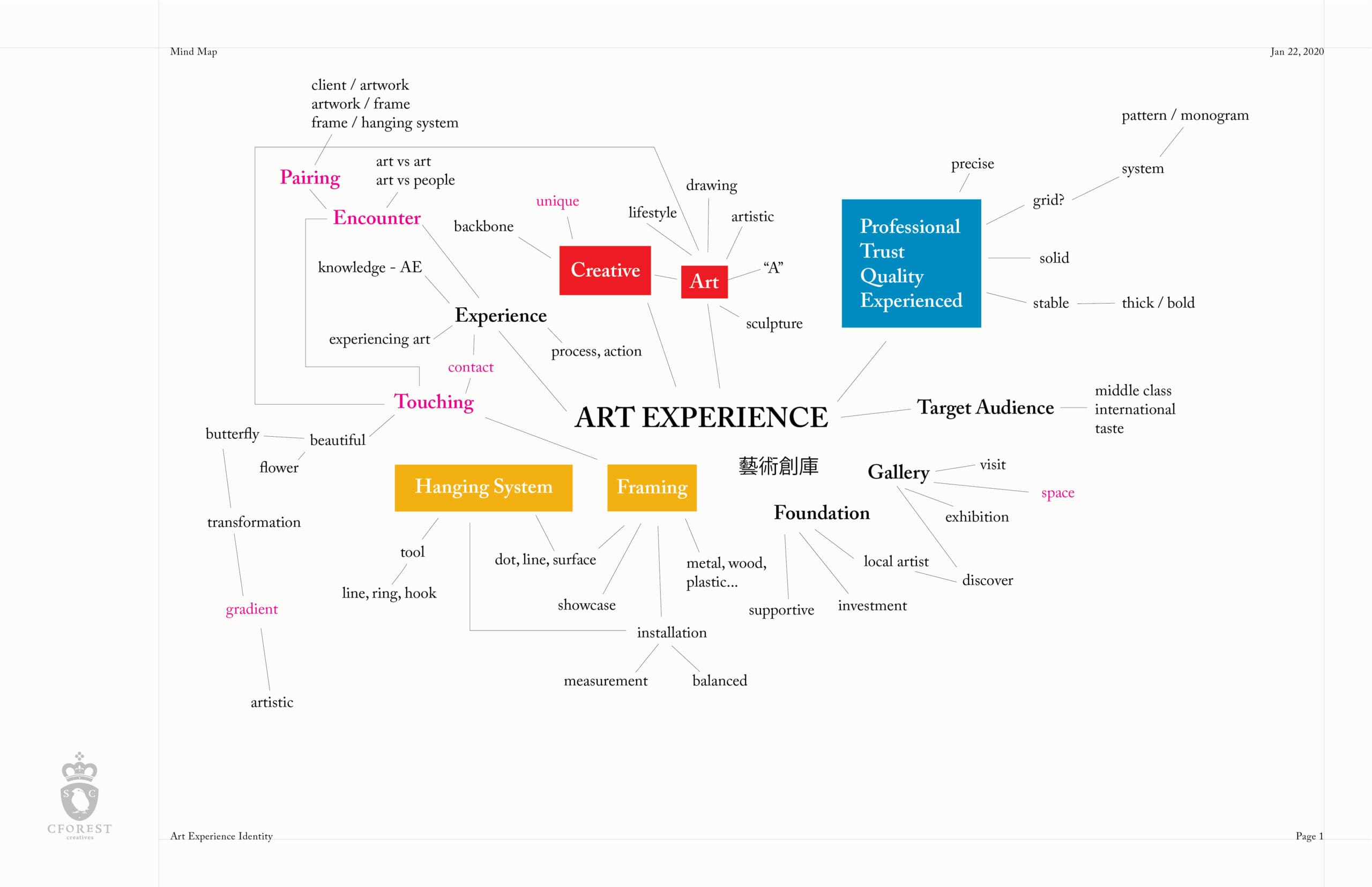
The defining essence of Art Experience’s LOGO lies in the core concept of pairing.
Whether crafting a bespoke frame for an artwork, selecting the perfect hanging system for a gallery, or sourcing fine art pieces for discerning clients, Art Experience excels at this art of pairing with its professional expertise and decades of experience. The entire process centers on encountering, pairing and experiencing—and it is within this process that the brand’s excellence in the art industry truly shines.
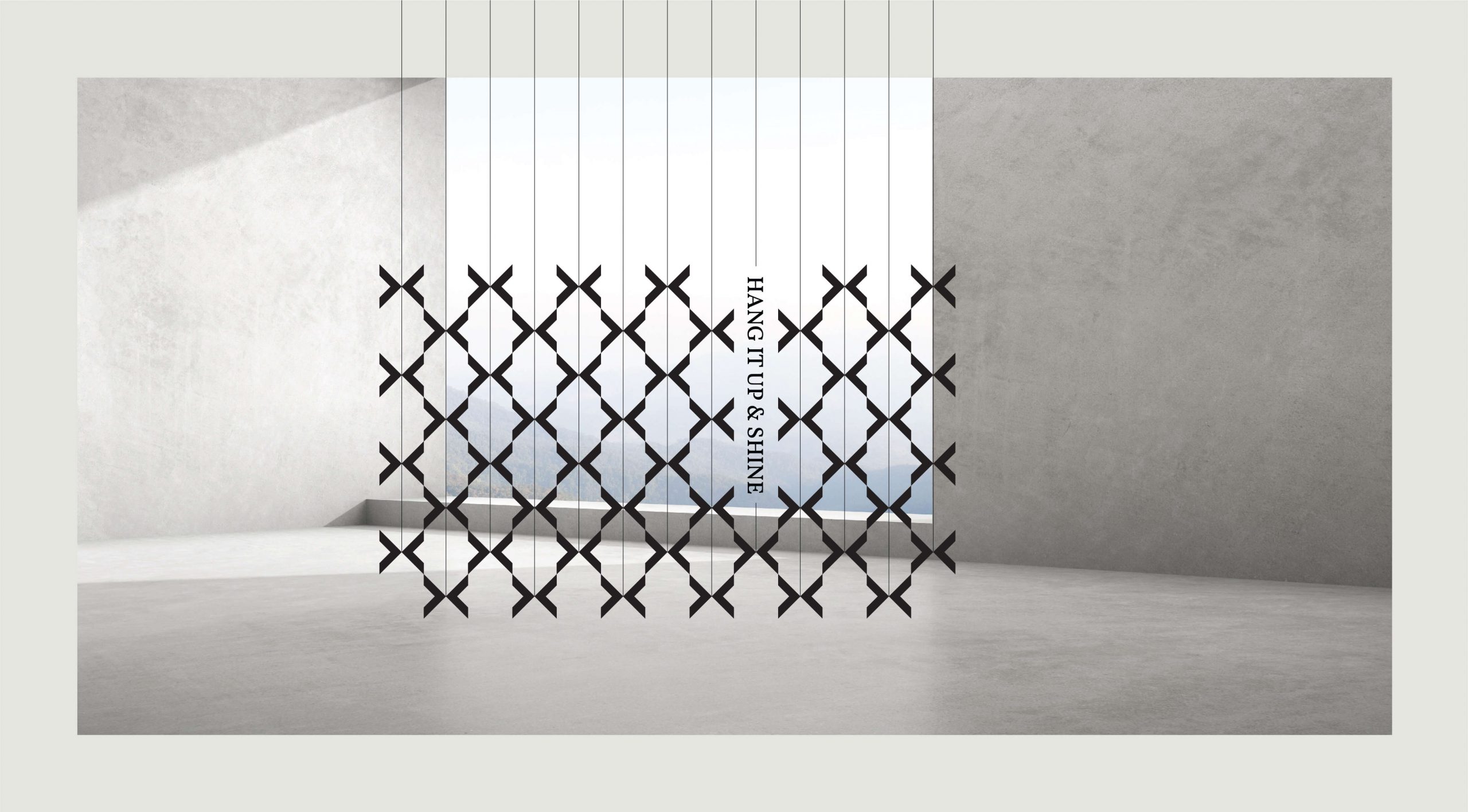
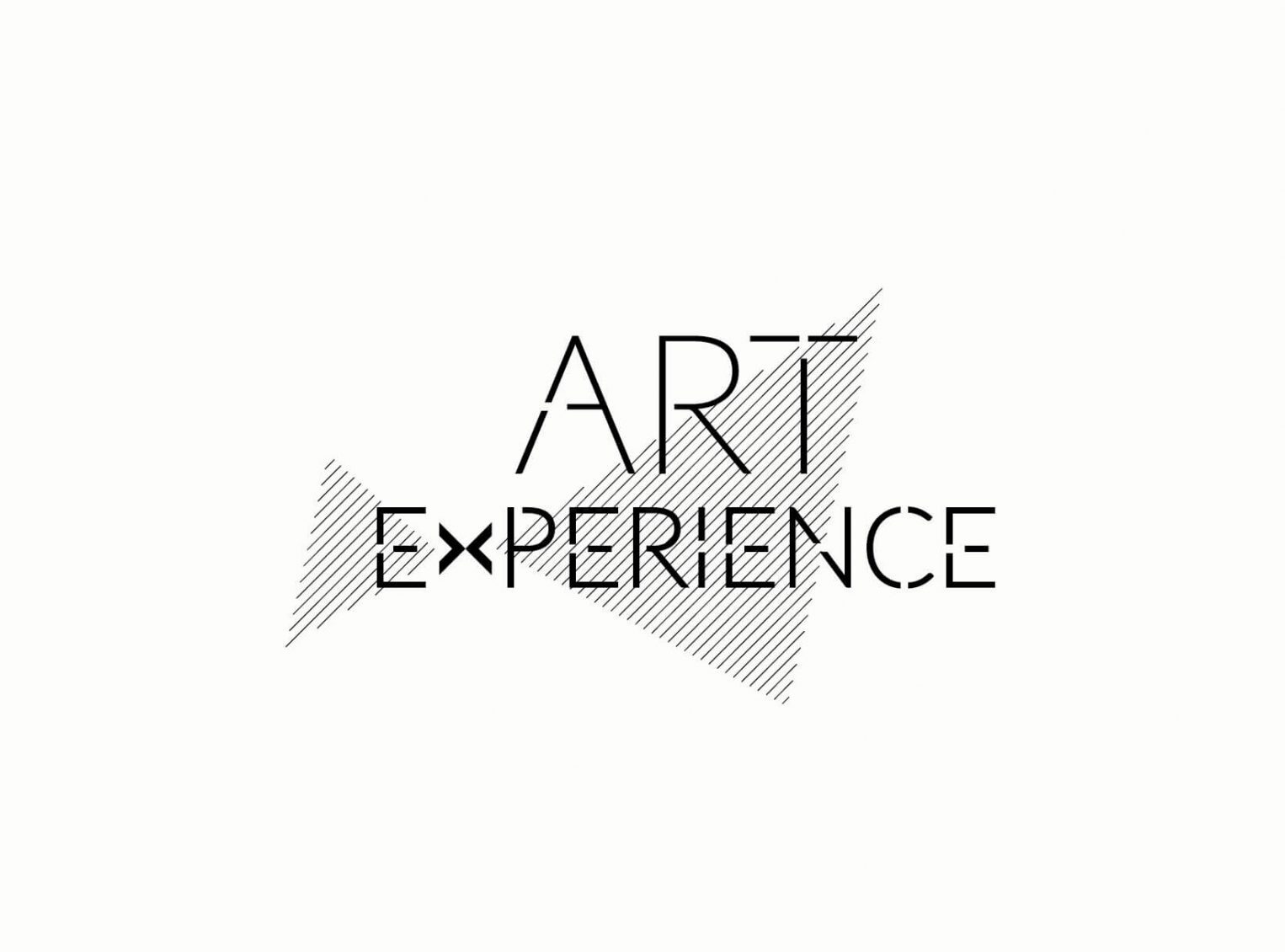
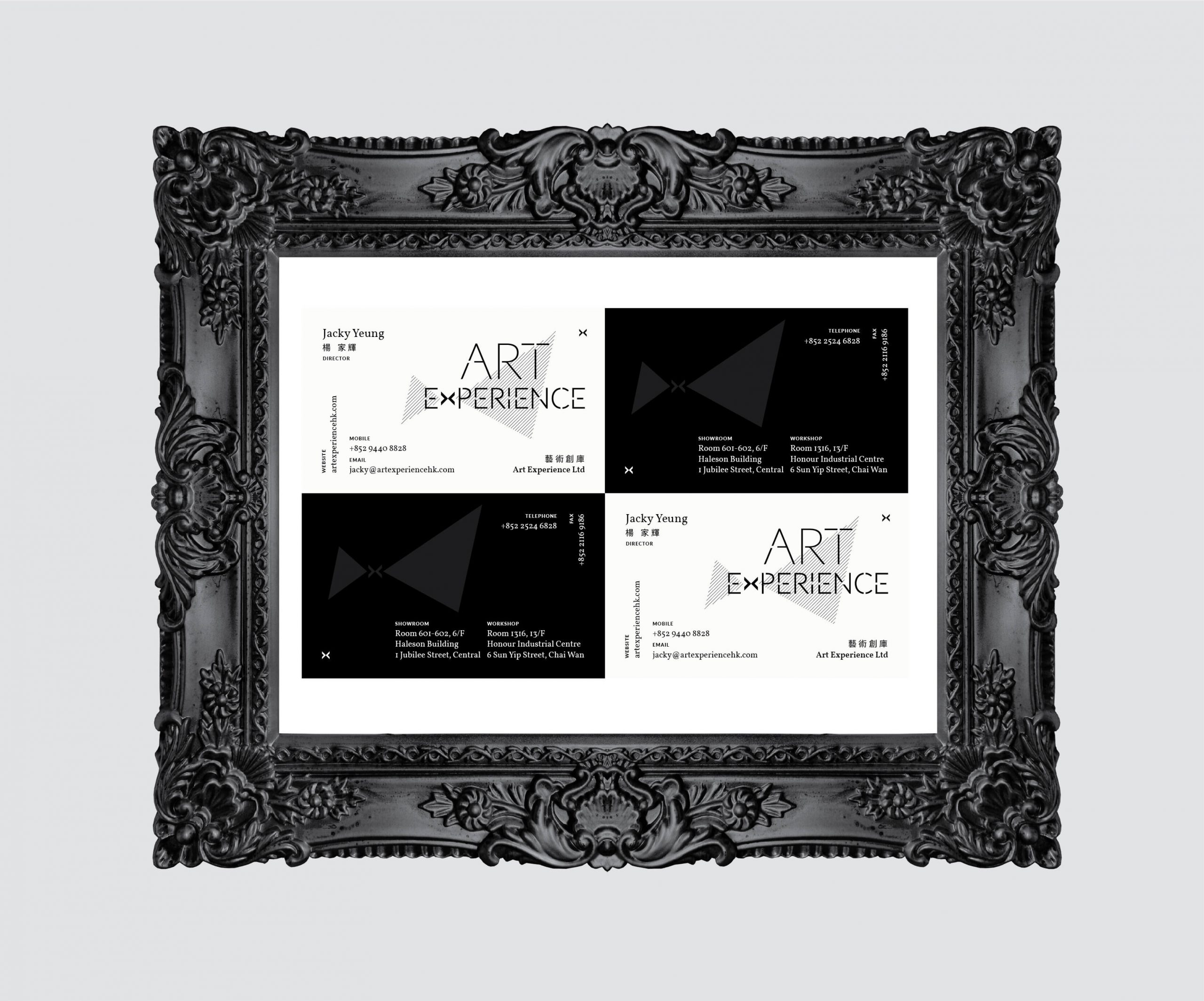
The design takes two triangles, a symbolic nod to the framing industry, and weaves them into the letter X—a visual embodiment of pairing, connection and experience. A pair of wing-like motifs extend outward from the X, symbolizing beauty and inspiration, as well as the brand’s courage to explore new frontiers and drive constant innovation in the art world.
The black, white and grey color palette forges a bold, distinctive visual style with a timeless, classic charm. As a neutral palette, it also reflects the brand’s objectivity and inclusivity. The asymmetrical structure and wing-like motifs infuse the design with dynamism and the creative flexibility inherent to art. Above all, the design encapsulates the brand’s core traits: contemporary elegance, profound substance and uncompromising professionalism. The entire design is anchored by delicate thin lines, creating a strong visual dialogue with the linear aesthetics of frames and hanging systems. Lines formed by connecting dots further symbolize connection and the brand’s emphasis on communication; the interrupted typography subtly alludes to the concept of unseen connection.
Framing Beauty to Elevate Beauty | Creative Statement
Imagine standing in a private viewing room the night before an artwork is auctioned. Bathed in soft, dim light, the piece radiates a breathtaking beauty: it is set within an exquisitely crafted classical gilded frame, its antiqued gold tones accentuating the deep emerald green of the background with refined elegance. The shimmer of light on the brushstrokes and the golden patterns of the figure’s attire echo the vine carvings on the frame; the warm gold of the frame balances the profound texture of the artwork… This artwork and its frame are truly a match made in heaven.
All transformative thinking is art.。
The art of framing and mounting is an art of framing beauty to elevate beauty—it creates a sacred boundary that shields the artwork from the outside world, letting its essence take center stage. When we talk about the design of this brand, we are, in essence, talking about art itself.