PROJECT INFORMATION
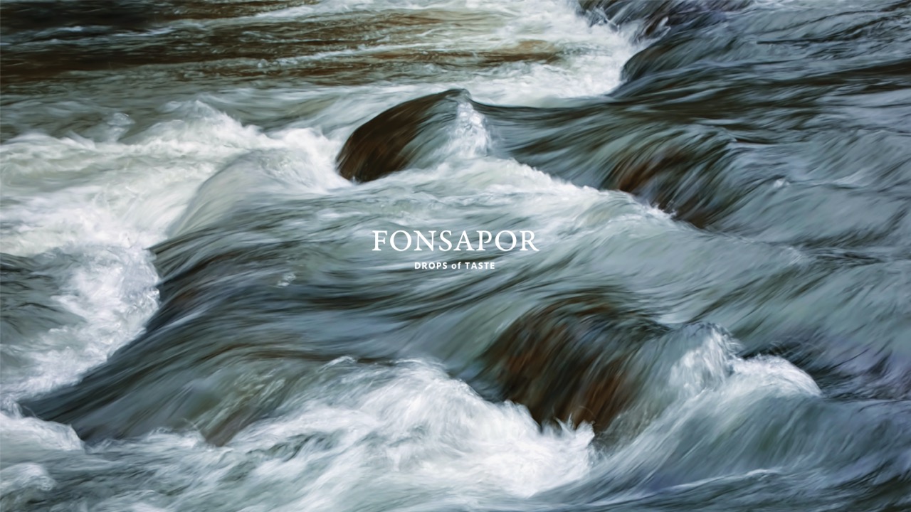
Savoring every drop of life
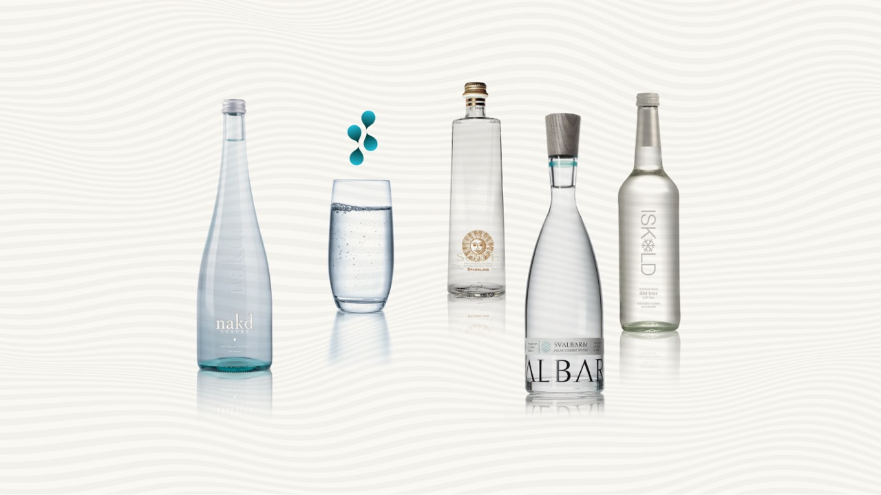
People is usually confused by different types of water in the market. As Water Sommelier, Our Mission is: “To help the public to find a right water that suit them the best.”
Founder – Ivan Lee
BRAND CONCEPT
The founder of Fonsapor is Hong Kong’s first Water Sommelier, who specializes in tasting the flavor and composition of water and analyzing its benefits to the human body. The profession of Water Sommelier is both professional and unique, and Fonsapor pursues the ultimate in professionalism, acting as an agent for premium mineral water, glacial water and other fine waters from around the world. The brand aims to let the public savor high-quality, healthy water sources.
- Brand Goal: To discover healthy, premium water sources from all over the world for people
- Brand Mission: More than just water — it represents a life attitude of pursuing quality, taste and health
- Brand Personality: Professionalism / Commitment to healthy living / Quality of life / Artisan spirit
Fons + Sapor = Drops of taste
We put great thought into the brand name Fonsapor. During discussions with the client, we discovered numerous affinities between Latin and water. As the origin of European languages, Latin has played a pivotal role in the nurturing of European civilization and cultural development. We fused these connections between water and Latin to create the brand name Fonsapor.
In English interpretation, Fons means water source and natural water, while Sapor stands for taste and savor. Together, they signify savoring fresh, original and natural water — a value that aligns perfectly with what the brand offers its customers: natural, premium water sources.
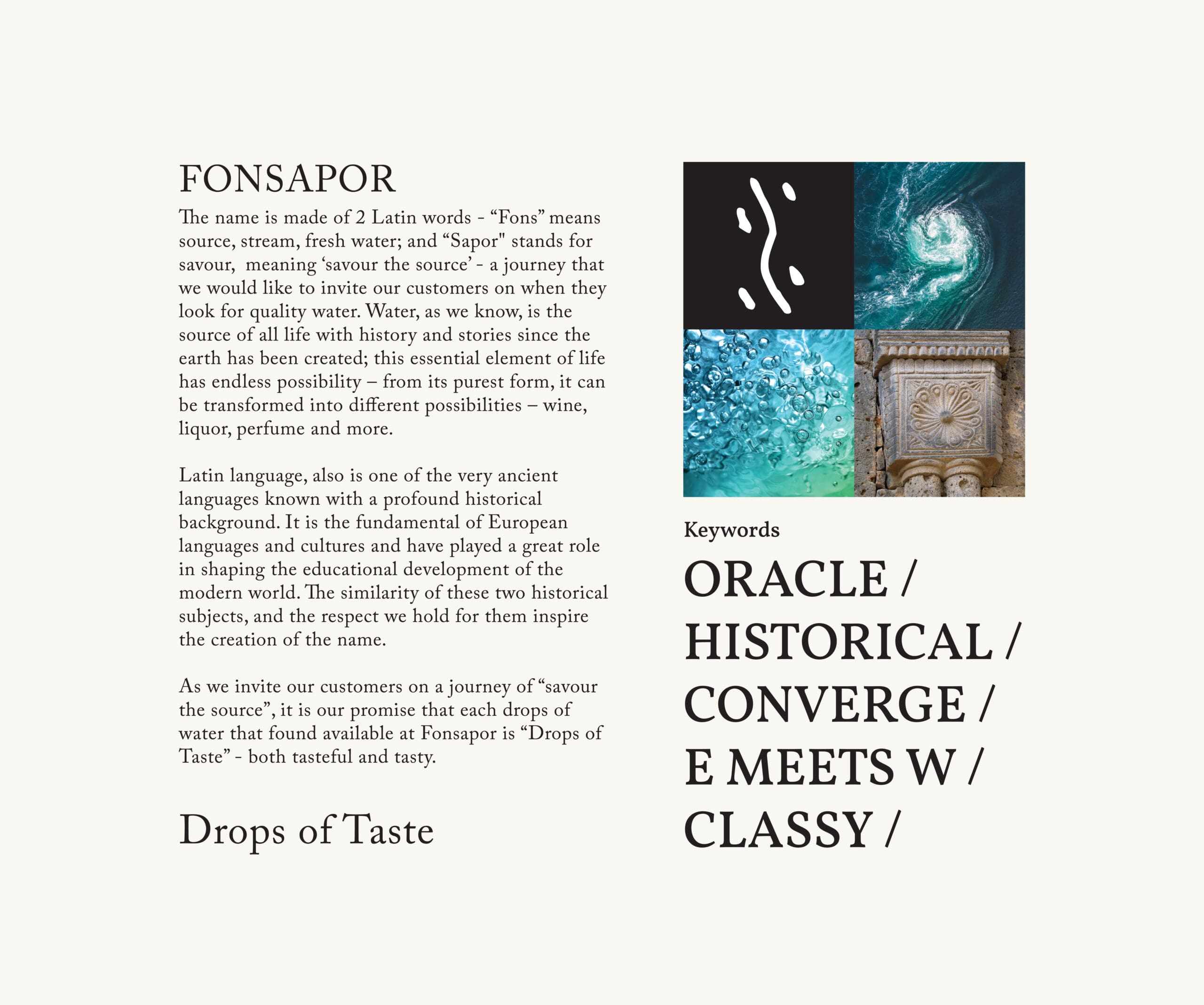
Latin, as a time-honored language, shares a long history with water. Existent on Earth since the beginning of time, water is a gift from nature to humanity, with a legacy as profound as any language. As the source of life, water holds the power to create endless possibilities — from tea and coffee to wine and beyond.
Thus, in our design conceptualization, we extracted the core keywords from the brand’s essence: Oracle Bone Script, Historical Feel, Convergence, Earth & Water Interaction, Timeless Class. These keywords defined the brand’s positioning as a curator of fine drinking water — and became the breakthrough point for distilling the product’s core value, elevating the brand image and adding premium value. For this, we implemented a more forward-looking brand visual management strategy.
Poetic Flowing Water
Our market research revealed a saturated drinking water market with countless brands, where product packaging and features lacked distinct differentiation. Consumers struggle to tell the brands apart, leaving their unique strengths unleveraged. Enhancing brand differentiation is therefore Fonsapor’s core market strategy.
Beyond minimalism and traditional styles, product packaging in the industry faces rigid limitations. To create a refreshing and distinctive impression, the brand LOGO must blend the brand’s professional identity with the aesthetic preferences of young target audiences, achieving innovation within tradition.
Art and design have always been intertwined. We sought to fuse Fonsapor’s creative vision with ecological elements such as mountains and forests, and water elements like springs and lakes. With undulating, flowing lines, we crafted a master visual that is minimalist yet rich in design detail, capturing the fluidity of spring water and infusing the visual with vivid vitality.
The Ritual of Four Waters Converging, The Realm of Time and Space in Flux
Water is the source of abundance, and convergence is its essence. The ancient concept of "four waters converging into the hall" speaks to water gathering at the heart of all things.
We designed the four water droplets in the LOGO to point in the same direction, converging inward — as if drawing the boundless celestial water from all directions into Fonsapor, holding the nectar of heaven and earth, and embracing the radiance of the sun and moon. In this way, the brand becomes a perpetual convergence point for the world’s finest water sources.
The layout of the LOGO also echoes the character "Shui (water)" in Oracle Bone Script — composed of four minimalist water droplets, with a subtle S-shaped flow winding through the center.
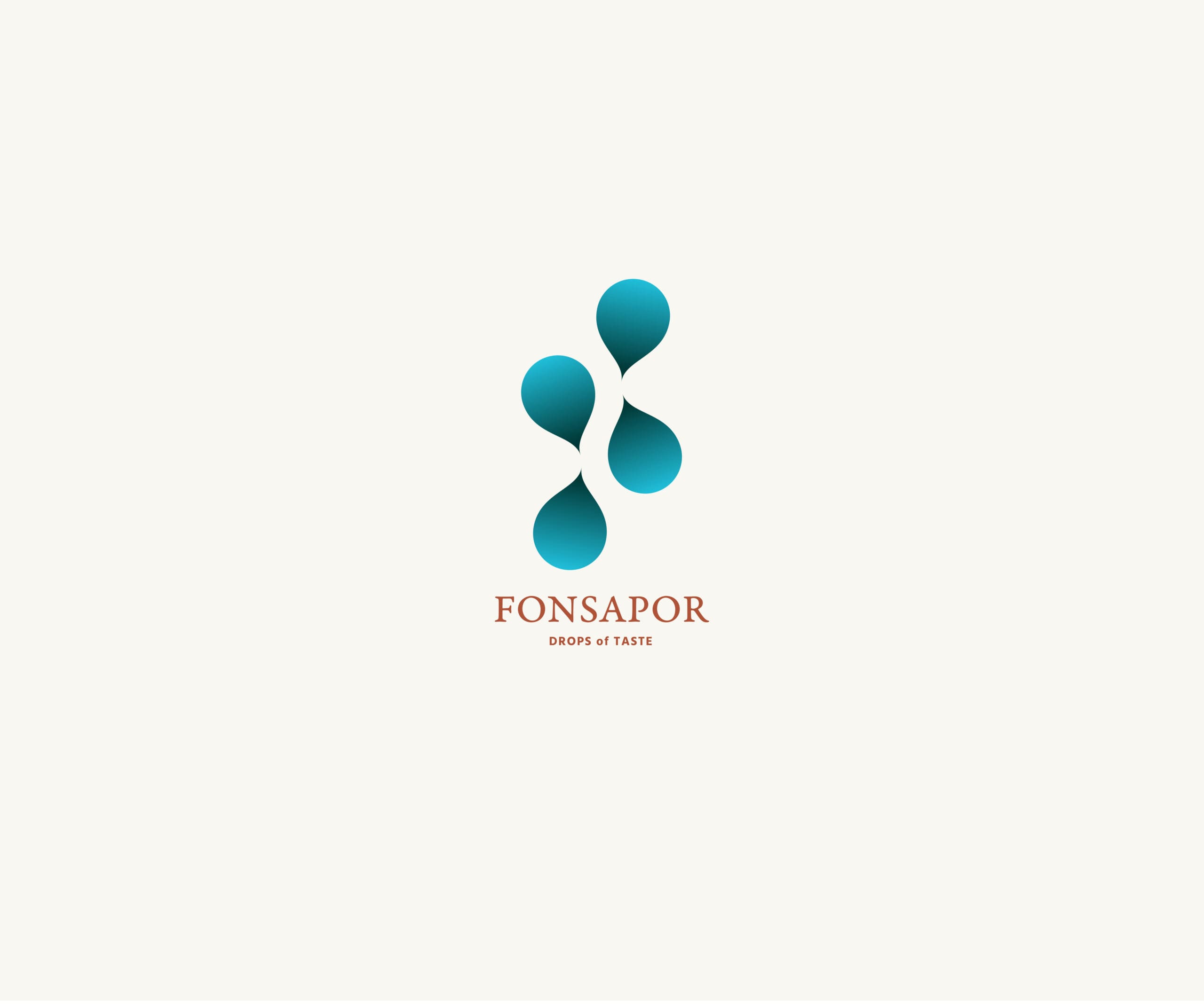
Furthermore, the Oracle Bone Script for "water" represents the East, while the Latin brand name stands for the West, symbolizing the integration and exchange of Eastern and Western cultures. This aligns with the brand’s philosophy: dedicated to introducing Western water and drinking water culture to the East, and to Hong Kong in particular.
This LOGO’s defining strength lies in its combination of graphics and typography, forging a distinctive identity system that excels in functionality, appeal and communicability.功能性、吸引力、溝通性的辨識體系。
The Interweaving and Rebirth of Water Droplets and an Artistic Life
A single tree makes a forest, a single stream makes a lake — to feel the quiet beauty of nature is to embrace the vitality of life. Though water is cold in nature, it flows endlessly and unyieldingly, weaving through the gaps of the world like the life force that runs through our own lives, merging into the vivid world with its gentle yet persistent power.
Art is a quiet, deep river flowing in the recesses of the mind — through fusion and acceptance, all things ultimately converge at the heart. Along the way, every sight and sound, every play of light and shadow, every water droplet and every current, becomes a touching mystery. Sunlight brightens the texture of the water’s surface, lending the entire space a sense of tranquil depth, where reality and illusion blend in a subtle, evocative harmony.

Fonsapor, savoring every drop of life
Water from around the world has its own unique taste. Behind the slogan "Drops of Taste" lies a simple truth: every drop of water from different brands carries a distinct flavor. The word Taste also means discernment and refinement — Fonsapor offers more than just water; it represents a life attitude of pursuing quality, taste and health. Alongside the graphic design, we endowed the brand
with the core values of Quality, Sharing, Communication. The design revolves around the brand’s core selling points, leveraging the imagery of water resources and the natural ecosystem to position Fonsapor for the mid-to-high-end consumer group.
The Beauty of Water, the Myriad Forms of Life | Creative Statement
We are privileged to have partnered with Fonsapor, and we wish the brand great success in introducing the profession of Water Sommelier to Hong Kong. With its unique and professional style, Fonsapor embodies the artisan spirit, dedicated to sharing high-quality water sources with the public, guiding customers to savor the subtle quality of water, fostering a greater appreciation for health, and cultivating an exquisite life attitude.
A LOGO with historical resonance can fulfill all visual identity functions within the most concise space — it may even define a brand’s core value. For Fonsapor’s LOGO, our core vision was to spark the imagination the moment it is seen. We use color, the scale of the water droplets, and the very essence of water — its temperature, state and aroma — to evoke an extraordinary sensory experience for the viewer.
The mission of every artistic creation we make is not to imitate nature, but to inspire thought. We look forward to crafting poetry with you, and exploring the boundless realm of creative freedom.


